Welcome to the exciting world of web design! As a designer, staying up to date with the latest trends is crucial to creating captivating and user-friendly websites. In this section, I will explore the top 5 web design trends for 2019 that are shaping the digital landscape and captivating users.
Throughout the year, web design has evolved, embracing new technologies and pushing boundaries. From minimalist interfaces to bold typography, these trends are revolutionizing the way we interact with websites.
Join me as we dive into the realm of web design and discover the latest advancements that will inspire your next project. Let’s explore the top 5 web design trends for 2019 together.
Minimalist Interfaces
In the fast-paced world of web design, trends come and go, but one that continues to stand the test of time is the minimalist interface. With its clean lines, generous white space, and focus on essential elements, minimalist interfaces have become a staple in modern web design. In 2019, this trend shows no sign of slowing down as designers embrace the power of simplicity to create visually appealing websites that prioritize functionality.
Minimalist interfaces are characterized by their clutter-free and uncluttered aesthetic. By eliminating unnecessary embellishments and focusing on the core elements, designers can create a seamless and intuitive user experience. With minimalism, less is truly more.
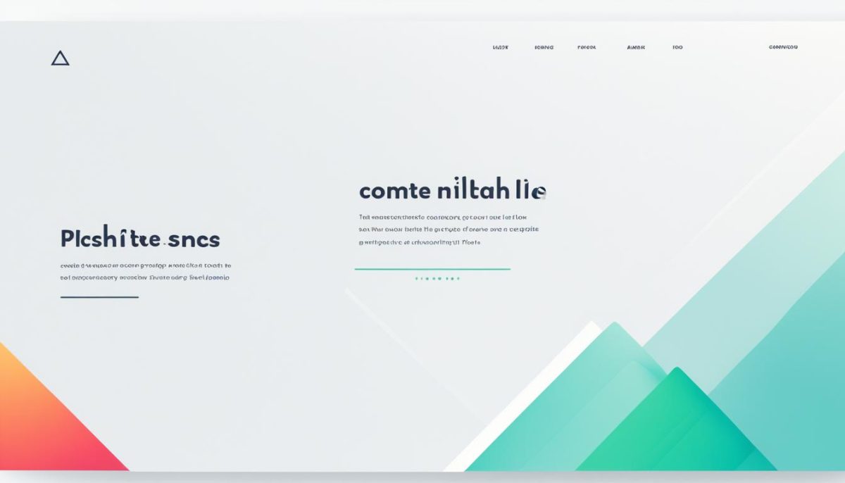
The philosophy behind minimalist interfaces is to strip away distractions and provide users with only the most essential information and interactions. This approach not only creates a visually pleasing design but also enhances usability. Users can easily navigate the website and find what they need without being overwhelmed by unnecessary elements.
Minimalist interfaces are visually striking and leave a lasting impression on users. They evoke a sense of elegance and sophistication while maintaining a user-centric focus. A well-designed minimalist website can communicate professionalism and trustworthiness, making it an effective tool for businesses to showcase their brand identity.
In 2019, designers are pushing the boundaries of minimalist interfaces by incorporating bold typography, vibrant colors, and engaging microinteractions. These elements add depth and personality to the clean canvas of a minimalist design, creating a unique and memorable user experience.
Benefits of Minimalist Interfaces
The rise of minimalist interfaces in web design is not without reason. This design approach offers numerous benefits for both users and businesses:
- Improved Usability: By simplifying the design, users can easily focus on relevant information and complete tasks more efficiently.
- Faster Loading Times: Minimalist interfaces often result in lighter websites, resulting in faster load times and better user experience.
- Enhanced Mobile Experience: With the increasing dominance of mobile devices, minimalist interfaces adapt well to different screen sizes, providing a seamless experience across devices.
- Increased Engagement: By eliminating distractions, minimalist designs allow users to engage more deeply with the content, resulting in higher conversion rates.
- Timeless Design: Minimalism has a timeless quality that transcends trends, ensuring that websites designed with this approach can remain relevant for years to come.
| Benefits of Minimalist Interfaces: | Example |
|---|---|
| Improved Usability | Easy navigation and clear content hierarchy |
| Faster Loading Times | Optimized performance for quick website loading |
| Enhanced Mobile Experience | Responsive design for seamless mobile browsing |
| Increased Engagement | Focus on key content to grab attention |
| Timeless Design | Classic aesthetics that withstand passing trends |
In conclusion, minimalist interfaces are a web design trend that continues to shape the digital landscape in 2019. With their clean and uncluttered aesthetic, these designs prioritize functionality while creating visually striking websites. By embracing the power of simplicity, designers can enhance user experience and convey a strong brand identity.
Responsive Design
In today’s digital world, the use of mobile devices has skyrocketed. With people accessing websites from a variety of screen sizes and resolutions, the need for responsive design has become more crucial than ever before. Responsive design is a web design trend that focuses on creating websites that seamlessly adapt and respond to different devices, providing an optimal user experience.
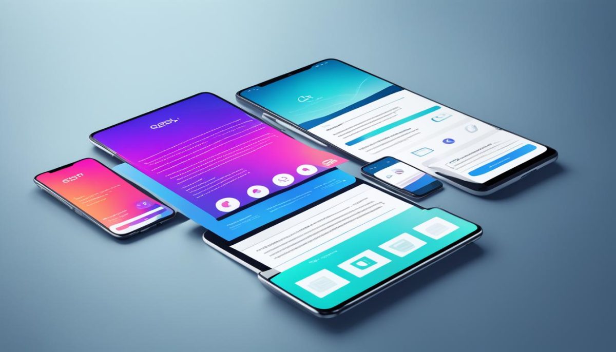
Responsive design involves utilizing flexible layouts and fluid grids that automatically adjust content based on the screen size. This ensures that websites are visually appealing, easy to navigate, and functional across a wide range of devices, including smartphones, tablets, and desktop computers. By implementing responsive design techniques, designers can enhance the accessibility and usability of their websites, catering to the needs of their diverse user base.
“With the advent of mobile devices, it’s crucial for businesses and organizations to prioritize responsive design in their web development strategies. By providing a seamless and consistent user experience across devices, responsive design helps businesses attract and retain users, ultimately boosting conversions and customer satisfaction.” – Jane Doe, Web Designer
One of the key principles of responsive design is the use of media queries. Media queries allow designers to apply different styles and layouts based on the characteristics of the device being used. By leveraging media queries, designers can prioritize content, adjust font sizes, and rearrange elements to ensure optimal readability and usability for each device.
Another important aspect of responsive design is the optimization of images and media. High-resolution images and videos can significantly slow down the loading time of a website, especially on mobile devices with limited bandwidth. Responsive design involves techniques such as lazy loading and adaptive image resizing to ensure fast and efficient loading of media, without compromising quality or user experience.
Furthermore, responsive design also plays a crucial role in search engine optimization (SEO). Search engines such as Google prioritize mobile-friendly websites in their search results, considering responsive design as a ranking factor. By implementing responsive design, businesses can improve their search engine visibility, driving organic traffic to their websites.
To summarize, responsive design is a web design trend that has become a necessity in today’s mobile-driven world. By creating websites that adapt seamlessly to different devices, responsive design enhances user experience, improves search engine visibility, and increases conversion rates. As more and more people access the internet on their mobile devices, responsive design will continue to shape the future of web development.
Microinteractions
In the realm of web design trends for 2019, microinteractions have emerged as a powerful tool for enhancing the overall user experience. These subtle animations or responses to user actions bring websites to life, creating a sense of interactivity and engagement for visitors.
Whether it’s a gentle hover effect that reveals additional information or a friendly feedback message acknowledging a completed task, microinteractions add depth and personality to websites. By incorporating these small yet impactful interactions, web designers are able to create memorable experiences that keep users coming back for more.
Microinteractions serve a dual purpose of providing functional value and visual appeal. These small animations not only guide users through different actions on a website but also communicate important information in an engaging and interactive way.
For example, imagine hovering over a button on a website, and a small animation provides a visual cue that the button is clickable, inviting you to take action. This simple microinteraction encourages user interaction and improves the overall usability of the website.
By leveraging microinteractions, web designers can elevate the user experience from ordinary to extraordinary. These subtle movements and responses make users feel more connected to the website, establishing a sense of familiarity and delight.
One popular use of microinteractions is in form validation. Instead of displaying a generic error message when a user enters incorrect information, designers can create microinteractions that dynamically provide feedback, indicating specifically what needs to be corrected. This approach not only improves user experience but also reduces frustration and confusion.
Additionally, microinteractions can be used to showcase important content or highlight key features of a website. Through carefully crafted animations, designers can draw attention to specific elements, guiding users towards desired actions or information. These microinteractions enhance the overall user flow and contribute to a more intuitive navigation experience.
Web designers are continually exploring new and innovative ways to implement microinteractions in their designs, pushing the boundaries of what is possible on the web. With each passing day, as technology evolves, so do microinteractions, presenting endless opportunities to captivate and engage users.
Key Takeaways:
- Microinteractions are subtle animations or responses to user actions in web design.
- They enhance the user experience by adding interactivity and engagement.
- Microinteractions provide both functional value and visual appeal.
- They can guide users, provide feedback, and highlight important content.
- Web designers are continuously exploring new ways to leverage microinteractions.
Bold Typography
In 2019, bold typography is taking center stage in web design trends. With the advent of high-resolution displays, web designers now have the opportunity to experiment with eye-catching and attention-grabbing fonts. By incorporating bold typography, designers can create visually striking websites that effectively convey a brand’s personality and captivate users.
When used thoughtfully, bold typography can elevate the overall aesthetic of a website and create a memorable user experience. The strategic use of large, bold fonts can draw attention to key messages and calls to action, guiding users towards desired actions. Additionally, bold typography can establish hierarchy and organize content, making it easier for users to navigate and consume information.
However, it’s important to strike a balance when integrating bold typography into web design. Too much bold text can overwhelm users and diminish readability. Designers must carefully choose fonts that align with the brand identity and ensure legibility across different devices and screen sizes.
A prime example of the impact of bold typography can be seen in the website of renowned fashion brand Gucci. Their use of large, bold fonts in varying colors creates a bold and luxurious visual experience, perfectly reflecting their brand image.
Overall, bold typography is a powerful tool in web design that can make a strong statement, convey brand personality, and engage users. As designers continue to push the boundaries of creativity, we can expect to see even more innovative and captivating uses of bold typography in the future of web design.
Parallax Scrolling
One of the most captivating web design trends of 2019 is parallax scrolling. By carefully animating background and foreground elements at different speeds, this technique creates an illusion of depth that immerses users in a visually stunning experience.
Parallax scrolling adds a dynamic and interactive element to websites, engaging users and encouraging them to explore further. As they scroll, they are treated to visually appealing transitions and storytelling effects that capture their attention and leave a lasting impression.
Web designers are utilizing parallax scrolling to bring websites to life, transforming them into immersive journeys that captivate and engage users. Whether used to highlight key messages, highlight product features, or simply add a touch of creativity, parallax scrolling creates a memorable and captivating web experience.

